Introduction
Getting visitors to your website is only the first step in digital marketing. The real challenge is encouraging those visitors to take meaningful action. They may discover your business through Google search, click on a Google Ads campaign, visit from social media or follow a link in an email. However, if the page they land on does not communicate the value of your offer or make the next step clear, many potential customers will leave without contacting you.
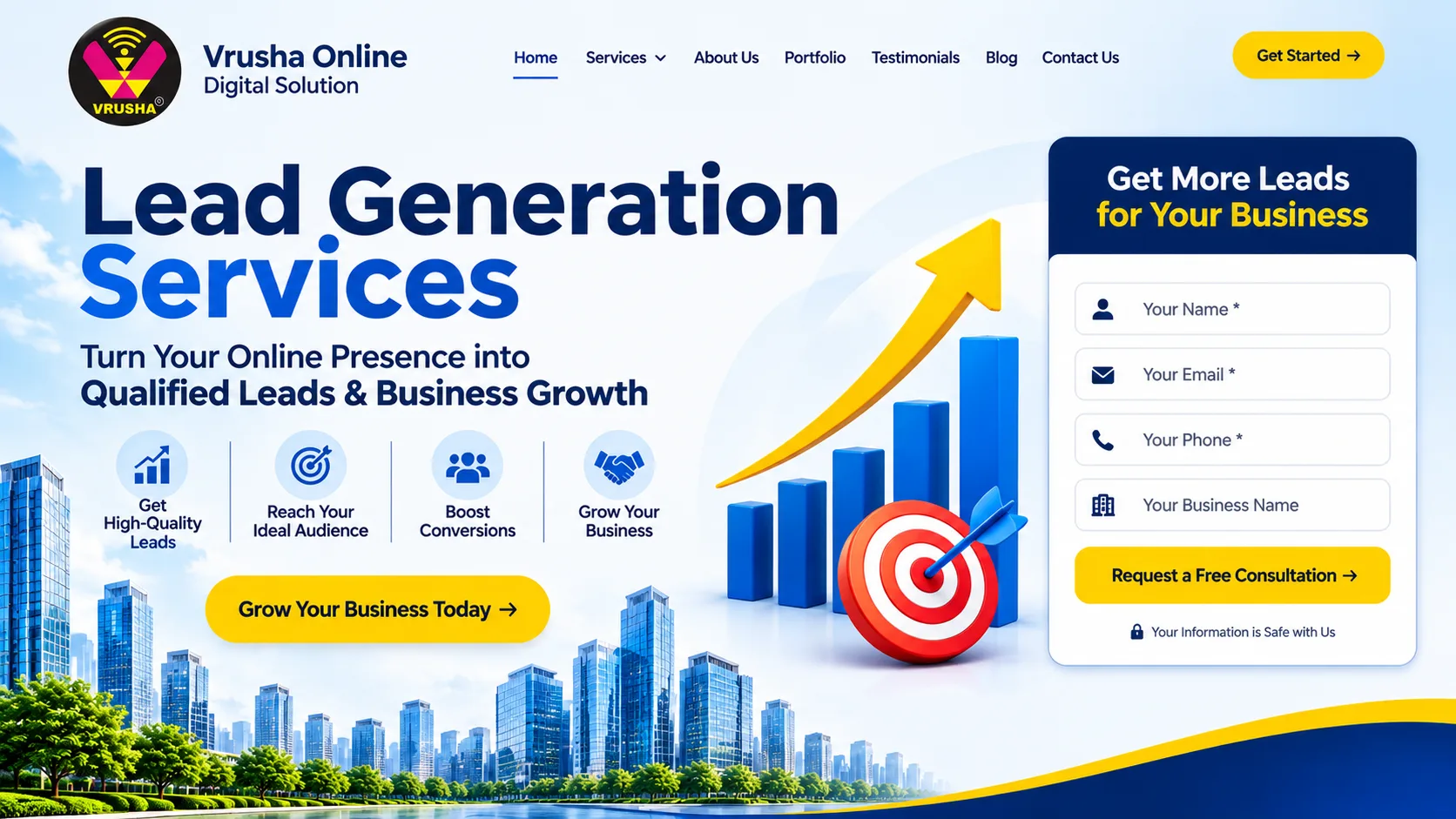
This is where effective landing page design for lead generation becomes important. A landing page is a focused web page created to encourage a specific action, such as submitting an enquiry, requesting a quotation, booking a consultation, registering for an event or downloading a resource.
Unlike a general website page, a lead generation landing page is built around a defined audience, a relevant offer and a primary conversion goal. Every element, from the headline and page layout to the form and call-to-action button, should support that goal.
At VrushaOnline, we view landing page design as a combination of marketing strategy, user experience, persuasive content and technical performance. A visually attractive page is useful, but its real value comes from how effectively it helps the right visitors understand an offer and become potential customers.
This guide explains the essential elements of lead generation landing pages, practical design strategies, common mistakes, optimisation methods and ways to measure performance. It also covers how businesses can develop landing pages that support their wider digital marketing and sales activities.
What Is Landing Page Design for Lead Generation?
Landing page design for lead generation is the process of planning, designing and developing a dedicated web page that encourages visitors to share their contact information or complete another business-related action.
The page is generally connected to a specific marketing campaign or offer. For example, a company advertising website development services may direct visitors to a page explaining its development solutions and inviting them to request a consultation.
The main purpose is to reduce uncertainty and make the conversion process straightforward.
A well-designed lead generation landing page usually includes:
A clear headline explaining the offer.
Supporting text describing the main value.
A relevant visual or demonstration.
Benefits that address customer requirements.
A visible call-to-action.
A simple lead capture form.
Trust-building information.
A responsive and fast-loading layout.
A confirmation message or thank-you page.
These elements work together to move visitors from initial interest to a measurable action.
Landing Page vs. Homepage
A homepage and a landing page serve different purposes.
A homepage introduces the business, its services, its brand identity and the different sections of its website. It usually contains several navigation options because visitors may have different interests.
A landing page has a narrower purpose. It focuses on a particular service, product, campaign or offer. Instead of encouraging visitors to explore multiple sections, it guides them towards one primary action.
For example, a digital marketing company homepage may introduce SEO, paid advertising, social media marketing and website development. A landing page for SEO consultation would focus specifically on the SEO offer, its benefits, the company's approach and a consultation form.
This focused structure makes it easier to align the page with the visitor's original reason for clicking an advertisement or search result.
Why Businesses Need Lead Generation Landing Pages
A landing page can connect marketing activity with the sales process. Businesses may invest in search engine optimisation, paid advertising, social media campaigns and email marketing to attract potential customers. Without an effective destination, however, that traffic may not produce enough enquiries.
A dedicated landing page gives visitors a clear path to follow.
1. Convert Relevant Website Traffic
Not every website visitor is ready to purchase immediately. Some are researching options, comparing service providers or looking for additional information.
A relevant landing page can present an offer that matches the visitor's intent. A person searching for website development services, for instance, may be more interested in a page offering a website consultation than a general company homepage.
The closer the connection between the visitor's requirement and the page content, the easier it becomes for the visitor to understand the next step.
2. Improve Paid Advertising Campaigns
Paid advertising can generate traffic quickly, but campaign performance depends on what happens after someone clicks an advertisement.
Sending every advertisement visitor to the homepage may create a mismatch between the advertisement and the destination. A dedicated landing page can continue the same message, highlight the advertised offer and provide a relevant conversion option.
Google's guidance on effective mobile sites also highlights the importance of page speed, simple navigation and accessible forms when encouraging users to take action. https://support.google.com/google-ads/answer/2549057?hl=en-GB
3. Capture Business Enquiries
A lead generation form allows a business to collect information from interested visitors. Depending on the offer, this may include a name, email address, phone number, company name or service requirement.
The information helps the sales team understand the enquiry and respond appropriately.
However, businesses should avoid requesting unnecessary information. A form should collect enough details to support the next step without making the process difficult.
4. Support Lead Qualification
Not every enquiry represents an ideal customer. A business may receive submissions from people with different budgets, requirements, locations and purchase timelines.
A thoughtfully designed landing page can help set expectations before a visitor submits a form. It can explain the service scope, target customer, process and suitable use cases.
Where appropriate, a small number of qualification questions can help the business identify more relevant enquiries.
5. Measure Campaign Performance
A dedicated landing page makes it easier to measure specific actions associated with a campaign.
Businesses can track:
Page visits.
CTA button clicks.
Form starts.
Successful form submissions.
Phone number clicks.
WhatsApp enquiries.
Qualified leads.
Cost per lead.
Lead-to-customer conversion rate.
These measurements help marketing teams identify which campaigns and page elements are contributing to business enquiries.
Essential Elements of a High-Converting Landing Page
A successful landing page is not created by adding as many design elements as possible. It is created by selecting the right elements and arranging them in a way that supports the visitor's decision-making process.
1. A Clear and Relevant Headline
The headline is often the first major content element a visitor notices. It should immediately explain what the page offers and why the visitor should continue reading.
Avoid vague headlines such as:
Welcome to Our Website.
Quality Services for Every Business.
Your Trusted Digital Partner.
These statements do not communicate a specific offer.
A more focused headline could be:
Get a Website Designed to Generate More Business Enquiries
This tells visitors what the service is intended to achieve.
The headline should also match the advertisement, search result or link that brought the visitor to the page. If an advertisement promises a free consultation, the landing page should clearly continue that message.
2. A Supporting Subheading
The subheading provides additional context. It should explain how the offer helps the visitor or what makes the service relevant.
For example:
"Build a responsive, user-friendly business website with clear service information, enquiry forms and conversion-focused page layouts."
This supports the headline by describing the service in practical terms.
Keep the subheading concise. A visitor should not need to read a long paragraph to understand the offer.
3. A Strong Value Proposition
A value proposition explains why someone should choose the offer.
It should answer three questions:
What does the business provide?
Which customer problem does it address?
What useful outcome can the customer expect?
For a B2B service, the value proposition may focus on efficiency, reliability, professional support or a solution to a specific operational challenge.
For a local service provider, it may highlight service coverage, transparent processes, convenient scheduling or relevant expertise.
Avoid making unsupported claims such as guaranteed sales growth or guaranteed lead volumes. Explain the actual service benefits and provide evidence where available.
4. A Prominent Call-to-Action
A call-to-action (CTA) tells visitors what to do next.
Examples include:
Request a Free Consultation.
Get a Project Estimate.
Book a Strategy Call.
Talk to Our Team.
Request More Information.
Download the Guide.
The CTA should be easy to locate and use. It should also describe the action clearly.
Generic button labels such as "Click Here" provide little information. A specific label sets a clearer expectation.
Use one primary conversion goal on the page. Supporting links may be necessary, but competing primary CTAs can divide attention.
5. A Simple Lead Capture Form
The form is one of the most important elements of a lead generation landing page.
A form that asks for too much information may discourage visitors. A form that asks for too little may make it difficult for the sales team to understand the enquiry.
The appropriate form length depends on the offer and the level of commitment.
For a basic enquiry, the form may require:
Full name.
Business email or contact email.
Phone number.
Service requirement.
For a more detailed B2B consultation, it may also include company name, project budget or expected timeline.
Only request information that has a clear purpose. Use descriptive field labels, clear instructions and helpful error messages. Make sure the form works properly on mobile devices.
6. Relevant Images and Visual Content
Visuals help visitors understand the service and make the page more engaging.
Depending on the business, useful visuals may include:
Product photographs.
Service illustrations.
Website or application screenshots.
Team photographs.
Process diagrams.
Short demonstration videos.
Authentic project examples.
Images should support the page's message rather than serve as decoration.
Large background videos, oversized graphics and unnecessary animations can affect page performance. Optimise images and use formats and dimensions appropriate for the layout.
7. Trust Signals and Social Proof
Visitors may hesitate before sharing their contact information with a business they have not used before.
Trust signals can help reduce that uncertainty.
Examples include:
Genuine customer testimonials.
Verified reviews.
Relevant case studies.
Client feedback.
Professional certifications.
Business contact details.
Clear service information.
Privacy policy links.
Use authentic and verifiable proof. Do not create fictional testimonials, customer logos or performance statistics.
8. Mobile-Friendly Layout
Many visitors access landing pages through smartphones. A page that looks good on a desktop may become difficult to use on a smaller screen.
Mobile-first design should consider:
Readable font sizes.
Clear content hierarchy.
Proper spacing.
Buttons that are easy to tap.
Forms that fit the screen.
Compressed images.
Limited horizontal scrolling.
Clickable phone numbers where appropriate.
Google recommends designing mobile experiences that make it easy for users to find information and complete actions. https://support.google.com/google-ads/answer/2549057?hl=en-GB
9. A Clear Privacy Message
A lead form collects personal information, so visitors should understand how their details will be used.
Include a privacy policy link and explain relevant contact or communication practices. Obtain consent where required by applicable privacy laws and regulations.
A transparent approach can make visitors more comfortable submitting their information.
10. A Thank-You Page or Confirmation Message
After a successful form submission, visitors should receive clear confirmation.
A thank-you page can explain:
That the enquiry was received.
What happens next.
When the visitor can expect a response, if a realistic timeframe is available.
How to contact the business for urgent questions.
Relevant next steps or resources.
This also creates an opportunity to track successful conversions separately from button clicks and form starts.
How to Plan a Landing Page Before Design Begins
Design work should begin with a clear understanding of the campaign and its audience. Starting with colours, fonts or visual effects before defining the conversion goal can lead to a page that looks attractive but does not address visitor needs.
1. Define the Primary Conversion Goal
Decide what the page should encourage visitors to do.
Possible goals include:
Submit a service enquiry.
Request a quotation.
Schedule a consultation.
Register for a webinar.
Download a resource.
Request a product demonstration.
Start a free trial.
Choose one primary action. Other actions should support it rather than compete with it.
2. Identify the Target Audience
Understand who is expected to visit the page.
Consider:
Industry.
Business size.
Job role.
Location.
Main challenges.
Buying stage.
Budget expectations.
Decision-making process.
A landing page for small businesses may use straightforward language and focus on practical outcomes. A page targeting enterprise decision-makers may need more detailed information about integrations, security, scalability and implementation.
3. Understand Visitor Intent
Different visitors arrive with different expectations.
Someone searching for "website design company" may be comparing providers. Someone searching for "website redesign quotation" may be closer to requesting a proposal.
The landing page should address the visitor's likely intent instead of presenting generic information.
4. Create a Clear Offer
The offer should provide a reason to take action.
Examples include:
A free initial consultation.
A customised project estimate.
A service assessment.
A product demonstration.
An educational guide.
A registration opportunity.
The offer should be realistic, relevant and clearly explained.
5. Map the Visitor Journey
Consider the steps between the first page view and the completed conversion.
A simple journey might be:
Visitor clicks an advertisement.
Visitor sees a relevant headline.
Visitor understands the offer.
Visitor reviews the benefits and trust information.
Visitor completes the form.
Visitor receives confirmation.
The sales team receives and follows up on the enquiry.
Every unnecessary step creates another opportunity for visitors to abandon the process.
Landing Page Design Strategies That Support More Conversions
The following strategies help businesses improve the clarity, usability and effectiveness of lead generation pages.
1. Follow the Message-Match Principle
Message match means maintaining consistency between the traffic source and the landing page.
If a Google Ads campaign promotes "WordPress Website Development Services", the landing page should prominently explain that service.
A visitor should not have to search through unrelated information to find the offer.
Maintain consistency in:
Headline.
Service name.
Offer.
Supporting message.
CTA wording.
Visual style.
This creates a smoother experience from advertisement to landing page.
2. Keep the Layout Focused
A landing page should not contain every detail about the company.
Remove elements that do not support the conversion goal. Depending on the campaign, this may include unnecessary navigation links, unrelated promotions, excessive animations or multiple competing buttons.
A focused layout helps visitors understand the offer without distractions.
However, removing all navigation is not a universal requirement. The right approach depends on the audience, trust requirements, page purpose and business model.
3. Place Important Information Early
The top section of the page should communicate the offer and its main benefit.
A useful hero section includes:
Headline.
Supporting description.
Primary CTA.
Relevant image or visual.
Short trust statement, where appropriate.
Visitors should be able to understand the page's purpose quickly. Additional details can appear further down the page for people who need more information before making a decision.
4. Use Benefits Instead of Only Listing Features
Features describe what a service includes. Benefits explain why those features matter to the customer.
For example:
Feature: Responsive website development.
Benefit: Visitors can access service information and submit enquiries comfortably across smartphones, tablets and desktop devices.
Feature: CRM integration.
Benefit: Enquiry information can be transferred into the business's lead management process, reducing manual data entry.
A strong landing page connects features to customer requirements.
5. Make the CTA Visually Distinct
The primary CTA should stand out from surrounding content.
Use sufficient contrast, clear button text and appropriate spacing. Keep the button size suitable for touch interactions.
Repeat the primary CTA at useful points on longer pages, especially after sections that explain important benefits or provide supporting evidence.
The wording should remain consistent so visitors understand that each button leads to the same action.
6. Use Forms That Match the Offer
A short form is often appropriate for a low-commitment enquiry. A detailed consultation may justify additional questions.
For example, a simple contact request may ask for a name, email and requirement. A B2B software demonstration request may also ask for company size and business role.
Do not make every field mandatory without a clear reason.
Where a longer form is necessary, consider grouping questions into logical steps and showing visitors how much of the process remains.
7. Add Relevant Proof Near Decision Points
Place testimonials, project examples or service credentials where visitors may have questions.
For example, a testimonial about project communication may be useful near a consultation form. A relevant case study may help explain how a service addresses a business problem.
Avoid placing all proof at the bottom of a long page if it is important to the visitor's decision.
8. Improve Page Loading Performance
Slow pages can interrupt the visitor journey, especially on mobile networks.
Useful optimisation practices include:
Compressing images.
Using modern image formats.
Reducing unnecessary JavaScript.
Limiting third-party scripts.
Enabling appropriate caching.
Using reliable hosting.
Avoiding excessive animation.
Loading non-critical assets efficiently.
Google's Core Web Vitals provide useful performance measures for loading, responsiveness and visual stability. Businesses can use these measurements alongside real user testing to identify technical issues.
Reference: https://web.dev/articles/vitals
9. Make the Page Accessible
Accessibility should be considered during design and development.
Use readable text, sufficient colour contrast, descriptive labels and keyboard-friendly interactions. Provide meaningful alternative text for informative images and ensure form errors are communicated clearly.
Accessible design can make the page easier to use for a wider range of visitors.
The W3C Web Accessibility Initiative provides guidance on accessible forms and user interfaces: https://www.w3.org/WAI/tutorials/forms/
10. Test the Complete Conversion Journey
A page may appear correct in a design preview but fail during actual use.
Test the complete process:
Open the page on different devices.
Click every CTA.
Submit the form.
Check required field validation.
Confirm that enquiries reach the correct destination.
Check the thank-you page.
Verify analytics events.
Review the page on different browsers.
Testing should happen before launch and after significant changes.
Landing Page Design for Different Business Models
The most effective page structure depends on the business, audience and type of conversion.
1. Landing Pages for B2B Companies
B2B visitors often need more information before contacting a provider.
A suitable page may include:
Business problem.
Service overview.
Solution details.
Implementation process.
Relevant experience.
Case studies.
Consultation CTA.
The content should explain how the service supports business objectives without making unsupported performance promises.
2. Landing Pages for Local Service Businesses
Local businesses may receive enquiries through search, maps, social media and paid advertisements.
Useful elements include:
Service area.
Services offered.
Contact number.
Operating hours, where relevant.
Customer reviews.
Service process.
Enquiry form.
Directions or location details, when appropriate.
A mobile-friendly call button can be particularly useful for visitors who prefer speaking directly with the business.
3. Landing Pages for E-commerce Businesses
E-commerce landing pages may promote a product category, product launch or seasonal offer.
Important elements include:
Product images.
Clear product benefits.
Pricing and offer terms.
Delivery information.
Return policy.
Customer reviews.
Purchase CTA.
The page should provide enough information for visitors to make an informed decision.
4. Landing Pages for SaaS and Technology Companies
Software companies may use landing pages to encourage visitors to book demonstrations, request trials or speak with a sales team.
Useful content includes:
Main product capability.
Customer problem.
Key features.
Integration details.
Security information, where relevant.
Product screenshots.
Demo form.
The page should make the next step clear and explain what the visitor can expect from the demonstration or trial.
5. Landing Pages for Education and Training Providers
Educational organisations may want visitors to request course information, register for an event or apply for a programme.
A useful page may contain:
Course or programme details.
Eligibility requirements.
Learning outcomes.
Duration.
Fees, if applicable.
Enquiry form.
Registration CTA.
Avoid hiding essential information behind a form if visitors need it to make an informed decision.
SEO Considerations for Lead Generation Landing Pages
A landing page may be designed primarily for advertising traffic, organic search traffic or both. Its SEO approach should reflect the intended role.
1. Select a Relevant Primary Keyword
Choose a keyword that reflects the page's service and search intent.
For a page promoting landing page services, possible keyword variations include:
Landing page design for lead generation.
Lead generation landing page design.
Conversion-focused landing page design.
Landing page development services.
Business landing page design.
Custom landing page development.
Use the primary keyword naturally in the page title, H1, introduction and relevant sections.
Do not force the keyword into every paragraph. Related phrases and useful explanations help create a natural reading experience.
2. Write a Descriptive SEO Title and Meta Description
The SEO title should explain the page's subject and encourage relevant clicks from search results.
The meta description should summarise the offer and provide a reason to visit the page.
Avoid repeating keywords unnaturally or making claims that the page cannot support.
3. Use One Clear H1
The H1 should describe the main topic of the page.
Supporting sections should use a logical H2 and H3 hierarchy. This improves content organisation and helps visitors scan the page.
4. Optimise Images
Use descriptive file names and meaningful alternative text for informative images.
For example:
Image file name: landing-page-design-lead-generation.webp
Alt text: Conversion-focused landing page design for lead generation
Avoid using the same keyword repeatedly in every image alt attribute.
5. Use Internal Links Where They Help Visitors
Internal links can connect the landing page with relevant service information and supporting resources.
For example, a landing page design article can link to related VrushaOnline services such as website design and development, landing page development and website speed optimisation.
Use descriptive anchor text and ensure that the destination is relevant to the surrounding content.
6. Avoid Thin or Duplicate Landing Page Content
Creating several pages with almost identical content for different keywords or locations may produce a poor user experience.
Each page should have a clear purpose and provide information relevant to its intended audience.
Where several campaigns need separate landing pages, customise the content, offer and supporting information rather than simply changing the headline.
7. Consider Indexing Carefully
Not every campaign landing page needs to appear in organic search results.
Some pages are created exclusively for paid advertising, email campaigns or private registration links. Decide whether a page should be indexed based on its content, search value and intended purpose.
Use appropriate canonical and indexing settings as part of technical SEO.
How Landing Pages Support Google Ads and Social Media Campaigns
A landing page is an important part of a paid campaign because it continues the visitor experience after the advertisement is clicked.
Google Ads Landing Pages
A Google Ads landing page should closely match the advertisement and the keyword theme.
For example, an advertisement promoting "CRM Integration Services" should direct users to a page that explains CRM integration rather than a general digital marketing page.
Important considerations include:
Relevant headline.
Clear service description.
Consistent offer.
Fast loading.
Mobile usability.
Accessible form.
Accurate conversion tracking.
Facebook and Instagram Campaign Landing Pages
Social media visitors may discover a service while browsing content rather than actively searching for it.
The landing page should quickly explain the offer and provide enough context to encourage further interest.
Use relevant visuals, short supporting content and a clear CTA. Ensure that the advertisement and page communicate the same offer.
LinkedIn Campaign Landing Pages
LinkedIn campaigns often target professional audiences and specific business roles.
A landing page may focus on a consultation, industry report, webinar or business solution.
The content should explain the business value and provide relevant information for the intended decision-makers.
Measuring Landing Page Performance
A landing page should be evaluated using meaningful performance data rather than design preference alone.
1. Conversion Rate
Conversion rate measures the percentage of visitors who complete the defined action.
A basic formula is:
Conversion Rate = (Number of Conversions ÷ Number of Visitors) × 100
For example, if 500 visitors arrive on a landing page and 25 submit the enquiry form:
Conversion rate = (25 ÷ 500) × 100 = 5%
This example illustrates the calculation, not an industry benchmark. A suitable conversion rate depends on the offer, traffic source, audience, industry and level of commitment.
2. Cost per Lead
Cost per lead measures how much a campaign spends to generate one lead.
Cost per Lead = Total Campaign Cost ÷ Number of Leads
Businesses should also examine lead quality. A campaign that generates many irrelevant enquiries may be less valuable than one that generates fewer but more relevant opportunities.
3. Form Completion Rate
Track how many visitors start a form and how many successfully submit it.
A large difference between form starts and submissions may indicate issues such as excessive fields, unclear instructions, technical errors or concerns about sharing information.
4. CTA Click Rate
CTA click rate helps measure whether visitors are interacting with the primary action.
However, a click does not always represent a successful conversion. Track completed form submissions or other final actions separately.
5. Lead Quality
Measure whether the enquiries match the business's target customer profile.
Useful indicators may include:
Relevant service requirement.
Suitable location.
Budget compatibility.
Business type.
Purchase timeline.
Sales qualification status.
6. Lead-to-Customer Rate
The purpose of lead generation is not simply to collect contact details. Businesses ultimately want to create valuable customer relationships.
Tracking how many leads become customers helps connect landing page activity with commercial outcomes.
Common Landing Page Design Mistakes and How to Avoid Them
1. Using a Generic Headline
A headline that does not explain the offer creates uncertainty.
Solution: Use a clear, specific headline that communicates the service or benefit immediately.
2. Adding Too Many CTAs
Multiple competing buttons can make visitors unsure about which action to take.
Solution: Choose one primary conversion goal and use supporting actions only when they are genuinely useful.
3. Asking for Too Much Information
Long forms can create unnecessary friction, especially on mobile devices.
Solution: Request only the details needed for the next step. Collect additional information during follow-up when appropriate.
4. Ignoring Mobile Visitors
A page that is difficult to read or use on a smartphone can lose potential enquiries.
Solution: Design and test the mobile layout, including buttons, forms, text and images.
5. Using Unrelated Images
Decorative images may make a page look attractive without explaining the service.
Solution: Choose visuals that support the offer, show the product or demonstrate the process.
6. Making Unsupported Claims
Unverified promises can damage trust and create unrealistic expectations.
Solution: Use authentic testimonials, accurate service descriptions and evidence-backed statements.
7. Ignoring Page Speed
Heavy images, unnecessary scripts and poor technical configuration can affect loading performance.
Solution: Optimise media, reduce unnecessary code and test the page regularly.
8. Forgetting Conversion Tracking
Without accurate tracking, businesses may not know whether the page is producing enquiries.
Solution: Configure analytics events for successful submissions, calls and other relevant actions. Test each event before launching campaigns.
9. Failing to Follow Up on Leads
A well-designed form cannot deliver business value if enquiries are not handled properly.
Solution: Route submissions to the correct team, CRM or notification system. Establish a realistic follow-up process and monitor response quality.
10. Never Updating the Page
Audience expectations, offers and campaign performance can change over time.
Solution: Review the data, gather feedback and test improvements regularly.
The Importance of A/B Testing
A/B testing compares two versions of a page or page element to understand which performs better for a defined audience.
For example, a business may compare two headlines:
Version A: "Professional Website Design Services."
Version B: "Build a Business Website That Makes It Easier to Generate Enquiries."
The business can measure the effect of each version on a chosen conversion metric.
Other useful test areas include:
CTA wording.
Form length.
Headline structure.
Hero image.
Content order.
Trust signal placement.
Button position.
Offer presentation.
Change one major variable at a time where possible. Keep the audience and measurement approach consistent, and allow sufficient data to accumulate before drawing conclusions.
Do not assume that a result from a small number of visitors represents a reliable improvement.
How VrushaOnline Approaches Landing Page Design for Lead Generation
At VrushaOnline, an effective landing page should support the business objective behind the campaign. The design process should consider the visitor, the offer, the content, the technical requirements and the next step after conversion.
1. Business and Campaign Understanding
The first stage involves understanding the business, target audience, campaign purpose and desired conversion action.
This helps establish the page structure and content priorities.
2. Audience and Keyword Research
Research helps identify how potential customers describe their requirements and what information they expect to find.
Keyword research can also help determine whether the page should target organic search traffic, paid campaign visitors or both.
3. Content and Page Structure
The page is organised around a clear message hierarchy.
This may include the headline, offer, benefits, service explanation, trust information, CTA and lead form.
4. UI/UX Design
The visual design should make the page easy to understand and navigate.
Spacing, typography, colours, buttons and imagery should support readability and guide visitors towards the primary action.
5. Responsive Development
The page should work across desktop, tablet and mobile devices.
Forms, buttons, images and content sections should be tested at different screen sizes.
6. Technical SEO and Performance
Technical checks may include page speed, image optimisation, metadata, heading structure, indexing settings and other relevant SEO requirements.
7. Form and CRM Integration
Where required, lead forms can be connected to email notifications, CRM systems or other business tools.
The integration should be tested to confirm that information reaches the intended destination.
8. Analytics and Conversion Tracking
Tracking should be configured for the actions that matter to the campaign.
This gives the business a foundation for reviewing performance after launch.
9. Testing and Launch
Before publishing, the team should review the page content, responsiveness, forms, links, tracking and browser compatibility.
10. Continuous Improvement
A landing page should be reviewed after launch. Performance data can reveal opportunities to improve messaging, usability, technical performance and lead quality.
Businesses can explore related VrushaOnline services, including website design and development, SEO services, lead generation and nurturing, CRM integration and conversion rate optimisation.
The Future of Landing Page Design
Landing page design continues to evolve as user expectations, marketing platforms and web technologies change.
Personalised Experiences
Businesses may create different page experiences for audiences based on campaign source, service interest or customer segment.
Personalisation should remain relevant and transparent. It should help visitors find useful information rather than create confusing or intrusive experiences.
AI-Assisted Optimisation
AI tools can help marketing teams analyse content, identify possible improvements and develop alternative headlines or layouts.
However, recommendations should be evaluated using real user behaviour and business data. Automated suggestions should not replace strategy, testing or human review.
Better Analytics and Attribution
Businesses increasingly need to understand how visitors move from an advertisement or search result to an enquiry and eventually a sale.
Connecting landing page analytics with CRM information can provide a clearer view of lead quality and campaign contribution.
Accessibility as a Standard
Accessible design is becoming an increasingly important part of professional web development.
Readable content, clear forms, keyboard support and appropriate contrast benefit visitors and help create more usable digital experiences.
Faster and More Efficient Pages
Performance will remain an important part of user experience. Businesses should continue to optimise images, scripts, hosting and page structure as technologies and user expectations change.
Conclusion
Effective landing page design for lead generation requires more than an attractive layout. It brings together a clear offer, relevant messaging, user-friendly design, accessible forms, mobile responsiveness, reliable technical performance and measurable conversion goals.
A well-planned landing page helps visitors understand what a business provides and why the offer may be relevant to them. It also gives marketing teams a focused destination for campaigns and a practical way to measure enquiries.
Businesses should avoid treating landing pages as static promotional material. They should review performance, understand visitor behaviour, test improvements and ensure that captured enquiries reach the right people.
VrushaOnline approaches landing page design as part of a wider digital marketing strategy, connecting website experience with campaign objectives and lead management. With the right planning, development and ongoing optimisation, a landing page can become a valuable part of a business's lead generation process.
Frequently Asked Questions About Landing Page Design for Lead Generation
1. What is landing page design for lead generation?
Landing page design for lead generation is the process of creating a dedicated web page that encourages visitors to complete a specific action, such as submitting an enquiry, booking a consultation or requesting a quotation.
The page combines a clear headline, relevant offer, supporting information, CTA and lead capture form. Its structure is designed to make the visitor's next step easy to understand.
2. How is a landing page different from a business website?
A business website usually contains multiple pages and serves several purposes. It introduces the company, explains its services, provides contact information and helps visitors explore different areas of the business.
A landing page is more focused. It is generally created for one campaign, audience or offer and encourages visitors to complete a primary action rather than explore multiple sections.
3. What should a lead generation landing page include?
A lead generation landing page should generally include a clear headline, supporting description, value proposition, relevant visuals, CTA, enquiry form and trust information. The exact structure depends on the offer and audience.
It should also provide a mobile-friendly experience, appropriate privacy information and a clear confirmation after form submission. Every element should support the page's main objective.
4. How many form fields should a landing page have?
There is no universal number of form fields that works for every business. A simple enquiry may require only a name, email address and service requirement, while a detailed consultation may need additional qualifying information.
The best approach is to request only the information needed to respond appropriately. Test the form and review where visitors abandon it before deciding whether fields should be removed or changed.
5. Are landing pages important for Google Ads campaigns?
Yes. A relevant landing page can provide a better experience after someone clicks a Google Ads advertisement. It allows the business to continue the advertisement's message and present a matching offer.
The page should load efficiently, work on mobile devices and make the intended action clear. Businesses should also configure conversion tracking to measure completed enquiries rather than relying only on advertisement clicks.
6. Should a landing page have a navigation menu?
A landing page does not always need a full website navigation menu. For focused campaigns, reducing unnecessary links may help visitors concentrate on the main offer and CTA.
However, the decision should depend on the page purpose and audience. Important links such as a privacy policy, business information or supporting resources may still be appropriate.
7. How can I improve my landing page conversion rate?
Start by reviewing the headline, offer, CTA, form and mobile experience. Check whether visitors can understand the offer quickly and whether the form is easy to complete.
Then use analytics and A/B testing to identify areas for improvement. Test changes carefully and evaluate both conversion volume and lead quality.
8. Is mobile responsiveness necessary for lead generation landing pages?
Yes. Visitors may access a landing page from smartphones, tablets and desktop computers. A responsive design helps ensure that the content and conversion elements remain usable across screen sizes.
Test text readability, button size, form fields, image loading and page layout on real devices. Mobile usability should be part of the development process rather than an afterthought.
9. Can landing pages help generate qualified leads?
Yes. A landing page can explain the service, intended audience, process and relevant requirements before visitors submit their details. This helps potential customers understand whether the offer matches their needs.
A small number of relevant form questions can also support initial qualification. The sales team should then review the enquiries and determine which ones are suitable opportunities.
10. How do I measure landing page success?
Start by defining the main conversion action. Track visitors, CTA clicks, form starts, successful submissions, cost per lead and qualified enquiries.
Where possible, connect landing page activity with CRM and sales information. This helps the business understand whether the page is generating useful opportunities rather than simply collecting contact details.
11. Does landing page design affect SEO?
Landing page design can influence usability, mobile experience, content structure and technical performance. These areas are relevant to the overall quality of a web page.
For organic visibility, the page should also have useful content, relevant keywords, descriptive metadata, appropriate internal links and sound technical SEO. A design alone does not guarantee search rankings.
12. How often should a landing page be updated?
A landing page should be reviewed regularly, particularly when campaign performance changes, an offer is updated or visitors report usability problems.
Businesses can review analytics, form submissions, user feedback and technical performance to identify opportunities. Significant changes should be tested so that improvements are based on evidence rather than assumptions.
Practical How-To Questions About Lead Generation Landing Pages
1. How do I create a landing page for lead generation?
Start by defining the audience, campaign objective and primary conversion action. Decide whether the page should encourage visitors to request a quotation, book a consultation, register for an event or complete another action.
Next, prepare the headline, offer, benefits, supporting content, CTA and form. Design a clear page structure, develop the responsive layout, connect the form to the correct destination and test the complete conversion journey before launch.
2. How do I write a headline for a lead generation landing page?
Begin with the main requirement of your target audience. Identify what the visitor is looking for and explain the offer in direct, simple language. Avoid broad statements that do not communicate a specific service or benefit.
Write several headline variations and review them against the campaign message. The best headline should be easy to understand, relevant to the visitor and consistent with the advertisement or search intent that brought them to the page.
3. How do I create an effective CTA button?
First, decide what action visitors should complete. Use specific wording such as "Request a Consultation" or "Get a Project Estimate" rather than a vague phrase such as "Click Here."
Make the button visually distinct and place it near the main offer. Ensure that it is easy to tap on mobile devices and that clicking it leads to the expected form, booking area or next step. Track completed actions to measure whether the CTA is contributing to conversions.
4. How do I design a simple lead capture form?
List the information your team needs to respond to an enquiry. Start with essential fields such as name, email and service requirement, then add other questions only when they have a clear purpose.
Use descriptive labels, clear instructions and useful validation messages. Test the form on smartphones and desktops, check that submissions reach the correct email or CRM destination and provide a clear confirmation after successful submission.
5. How do I make a landing page mobile-friendly?
Use a responsive layout that adjusts to different screen sizes. Make sure the text is readable, images fit the available space and buttons are large enough to use comfortably.
Review the page on actual smartphones rather than relying only on a desktop preview. Test the form, navigation, phone links, page loading and confirmation process to identify problems that could prevent mobile visitors from converting.
6. How do I improve landing page loading speed?
Begin by checking the page's current performance. Large images, unnecessary scripts, excessive animation and poorly configured hosting can all contribute to slower loading.
Compress images, use appropriate modern formats, reduce unused code and review third-party integrations. Re-test the page after making changes and monitor real-user performance where data is available. Avoid removing essential features without checking their impact on the visitor experience.
7. How do I add trust signals to a landing page?
Identify genuine information that helps visitors evaluate the business. This may include customer reviews, project examples, relevant qualifications, service details and clear contact information.
Place proof near the content or form where visitors may need reassurance. Use accurate, verifiable information and obtain permission before publishing customer names, photographs or testimonials. Never create fictional reviews or unsupported statistics.
8. How do I connect a landing page form to a CRM?
First, identify the CRM system and the information that needs to be transferred. Map each form field to the corresponding CRM field, such as contact name, email, phone number and service interest.
Use a supported integration, plugin, API or automation platform, depending on the website and CRM setup. Test the connection with sample submissions, check for duplicate records and confirm that the right team receives notifications. Ensure that personal information is handled appropriately.
9. How do I track conversions on a landing page?
Define what counts as a conversion, such as a successful form submission, completed booking or tracked phone call. Configure the relevant analytics and advertising events for those actions.
Test the events before launching the campaign. Confirm that a successful form submission is counted correctly and that ordinary page views or button clicks are not incorrectly recorded as completed leads. Review the data regularly and compare it with actual enquiries received by the business.
10. How do I A/B test a landing page?
Choose one element that you want to improve, such as the headline, CTA wording, form length or hero image. Create a second version while keeping the remaining page elements as consistent as possible.
Send comparable traffic to both versions and measure the same conversion goal. Allow enough data to collect before choosing a winner, and consider lead quality as well as submission volume. Record the test result and use the learning to guide future improvements.